
Posts Tagged ‘trims’
Fabricut: Ombre Dream
![]()
Ombré Dream is inspired by nature’s mystical gradation of color from one shade to another or from light to dark: shaded sunsets, the skin of ripening fruit, the color of water from the shoreline to the deep sea, the changing leaves in autumn to name a few. An ombré’s gradual movement of color creates intrigue and a modern element to interior textiles and trimming.
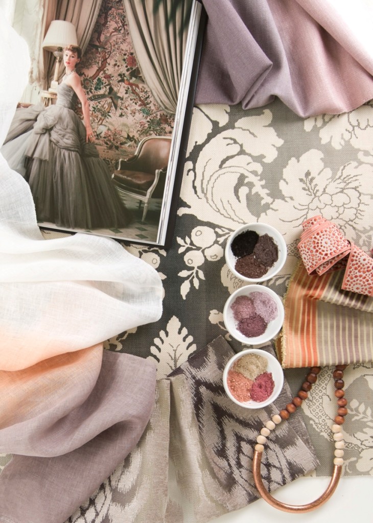
Featured Stroheim and Vervain products (clockwise from the top): Vacherin Ombré – Whisper (02) | Stancliffe – Charcoal (01) | Concentric – Coral (05) | Thynne Ombré – Slipper Pink (06) | Cambay – Mineral (01) | Montasio Ombré – Cameo (04)
|Original content and images via Fabricut |
Leading Edge Trimmings
![]()
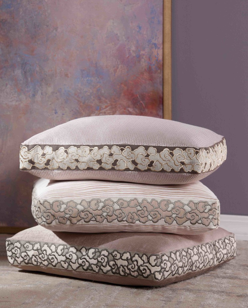
An unparalleled collection of exclusive trimmings, Stroheim’s Leading Edge Trimmings celebrates the evolution of the decorative border. Marked by statement wide widths, natural cotton and linen tapes, luscious embroidered and appliquéd details along with sumptuous velvet textures, these designs have been constructed using extensive handwork making each a true artisan creation.
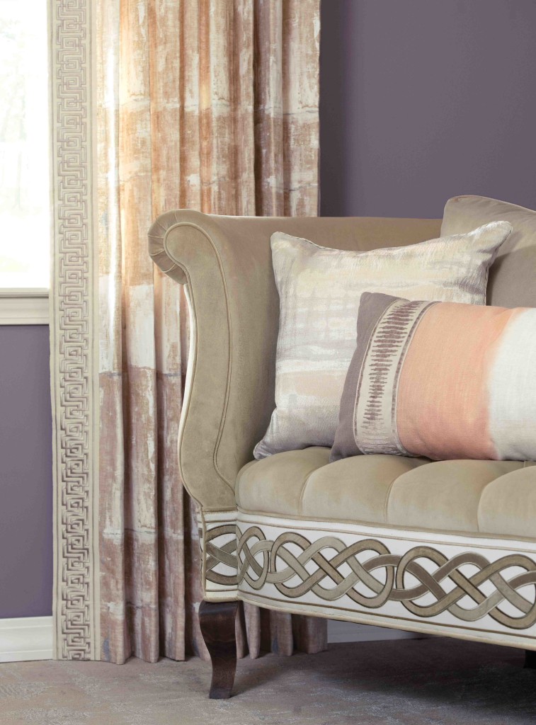
Featured fabrics and trimmings:
Top image: Danbo – Dusty Lilac (top pillow) / Cloudprint – Gold Dust (top pillow tape); Tymsboro – Cameo (middle pillow) / Cloudprint – Desert (middle pillow tape); Sancerre – Pebble (bottom pillow) / Cloudprint – Storm (bottom pillow tape).
Bottom image: Shropshire – Cameo (drapery) / Cyprus Key – Natural (drapery trim); Rivoli – Cashmere (settee upholstery) / Interweave – Mink (settee trim); Timboon – Cameo (left pillow) / Stripe – Cashmere (left pillow cord); Vacherin Ombre – Cameo (right pillow) / Khalil – Travertine (right pillow tape).
| Original content and images via Fabricut |
Fabricut: Isabelle de Borchgrave Wallcovering
![]()

A prominent Belgian artist and sculptor known for her colorful paintings and intricately painted paper costumes, Isabelle de Borchgrave collaborated with Fabricut last year to debut a collection of prints, wovens, embroideries and trimmings. Interpreting patterns and textiles from Italy, Japan, Uzbekistan and Egypt, Isabelle’s collection displays her sense of color and design in an inspiring and eclectic way.

This season Isabelle adds wallcovering to the mix, offering more exciting design possibilities. Isabelle’s expressive worldview, bold sense of color and intuitive painterly hand is seen in every fabric, trimming and wallcovering.

|Original content and images via Fabricut |
Introducing Vern Yip for Trend
![]()
Trend collaborates with award-winning interior designer and HGTV personality Vern Yip to debut an eclectic and inviting collection of fabrics and trimmings, Vern Yip for Trend. Inspired by his world travels and background in architecture, Vern’s collection for Trend encompasses his sophisticated style and pairs it with today’s most important design trends to create a collection of prints, wovens and embroideries.
Vern’s collection of patterns are arranged into four dynamic color stories – Grey/Charcoal, Natural/Sesame, Orange/Poppy and Blue/Ocean – offering enduring design through a clean and livable spectrum encompassing beautiful neutrals, warm reds and oranges, and a full breadth of blues covering everything from calm and cool to bold and invigorating. Additionally, a coordinating trim collection and two eminently usable books of solids – Manhattan Texture and Rosemary Linen – complete the assortment to offer a thorough and dynamic program for transforming spaces beautifully and affordably.
“This collection is a collaborative effort and each pattern has a function and a purpose; we share this philosophy of wanting to design things beautifully, but to keep them at price points that are accessible to everybody,†says Vern. “Much like my customers, my house is abuzz with work, kids, and dogs which means that it has to be effortlessly beautiful while also being practical and affordable.â€

| Original content and images via Fabricut |
Kravet Presents: Pantone Color of the Year 2015 Fabric Collection.
![]()

To coordinate with the announcement of the PANTONE Color the Year 2015, Kravet has introduced a capsule collection of perfectly paired fabrics in PANTONE 18-1438 Marsala. From wonderfully textured neutrals to vibrant patterns and prints, this collection offers immediate options for interior designers interested in incorporating the PANTONE Color of the Year 2015 fabrics into current and future design projects.
According to Pantone, the impactful, full-bodied qualities of Marsala allow the color to be used alone as one grounded statement color or as a hearty accent to many other colors. This highly varietal shade combines dramatically with neutrals including warmer taupes and grays. Browns are a natural fit with Marsala – from beige, terra cotta and camel to deep delicious chocolates. Because of its burnished undertones, sultry Marsala is highly compatible to amber, umber and golden yellows, greens in both turquoise and teal, and blues in the more vibrant range. Marsala pairs exquisitely with monochromatic mixes of peachy pinks and sparkles against antiqued gold metallics.
| Original images and content via Kravet |
Join Our Family!
Take a Look
Interior Design Service
Inspiring Resources
